
alex_aldo - Fotolia
Data visualization in machine learning boosts data scientist analytics
Data scientists offer practical insights into the role of visualization tools in building, exploring, deploying and monitoring their machine learning models.

Before using data visualization in machine learning, General Electric Power would always manage its financial workflows in a manual, time-consuming, labor-intensive manner. Business process analysts would hold a meeting and ask employees to describe their work.
"But there's inherently a problem with that," said Jeff Cowan, GE Power's senior IT director of continuous improvement and optimization. "Humans are conditioned to think of the most important things that they do. They don't necessarily think of all the activities that they do automatically. They tend to leave a lot of stuff out."
As a result, the analysts would have to watch employees process payment orders or send invoices to suppliers. "And 10 times out of 10, what's documented and what's observed are very, very different things," Cowan said. Mapping that process would take about one week, and the analysts would then look for areas of improvement. But that involved a lot of guesswork.
"Most likely, you already knew what you were going to focus on anyway," Cowan noted. So, in reality, the process was more about the certification than about actually improving the process, he added.
But that all changed last spring, when GE Power started using AI-powered process mining software from Celonis to automatically collect all actions by employees in the company's ERP systems, map them into business processes and clearly identify the business cost -- and benefit -- of every step in the process. The collected data includes hundreds of thousands of purchase orders and invoices and up to thousands of data points for each individual process.
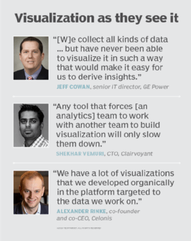
To make sense of all that information, GE Power's process teams use data visualization in machine learning tools. "[W]e collect all kinds of data from machines and processes but have never been able to visualize it in such a way that would make it easy for us to derive insights from it," Cowan said. The software's dashboards include charts and graphs as well as the ability to smoothly go from a big picture to detailed views -- four different levels of abstraction -- to focus on the factors that make the biggest impact.
The company discovered, for example, that vendors often changed their prices after their materials had been delivered. "If it's an increase [in price]," he explained, "most likely that price change hasn't been negotiated as thoroughly as it should have been. We went into the analysis thinking [that] prices change. But when we looked at the scale of what was happening, it was unbelievable. That was pretty eye-opening for us. When we saw where they were happening, it empowers us to start talking about it, to see if there's an opportunity to make an improvement in the process."
Going homegrown and off-the-shelf
For companies that have their own data scientist analytics teams, there are ready-to-go tools and libraries that can be used independently or are part of a data science platform. Celonis uses data visualization in machine learning tools as part of its development process when building machine learning models that power its software.
The company's data scientists use the Python programming language for machine learning applications in combination with its homegrown data visualization engine instead of using an off-the-shelf data science platform. Off-the-shelf tools don't provide the exact capabilities the company needs, said Alexander Rinke, co-founder and co-CEO of Celonis. "We have a lot of visualizations that we developed organically in the platform targeted to the data we work on," he explained.
Email security vendor GreatHorn Inc. prefers to use existing tools, said Christopher Jones, the company's senior data scientist. Since he wants tools that are flexible to adapt to his needs, Jones opts for programming solutions where he has the most control. "My preferred day-to-day is the Jupyter Notebook," he said. "What Jupyter does is integrate my analytics code with its visualization."
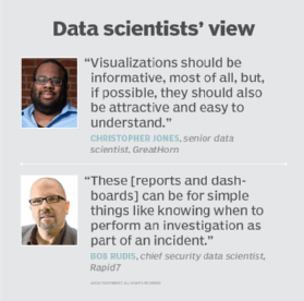
For the actual visualization, Jones uses ggplot, a system for declaratively creating graphics and based on the Grammar of Graphics library. "It gives you immense control over the look and feel of your visualizations," he said. "Visualizations should be informative, most of all, but, if possible, they should also be attractive and easy to understand. For this, I often turn to the Seaborn package."
Jones also uses commercial options successfully, including Tableau Software. "You don't have to reinvent the wheel for examining new data sets as it interoperates with a variety of typical data sources," he reasoned. "It's also easy to share with members of teams who are less technically oriented. It particularly came in handy when I needed to visualize map data. I used both Tableau and QlikView and didn't feel the need to try other solutions since they were good enough." Tableau's dashboard creation is "the main advantage over a programmer-based Jupyter Notebook," he added.
Cybersecurity software maker Rapid7 uses the R statistical programming language in combination with data visualization in machine learning. "It comes with the ability to perform small- and large-scale data manipulation and computation and then take the raw data or results of computations and work with them in many visual forms," said Bob Rudis, the company's chief security data scientist.
He also commended ggplot for static visualization as well as several interactive visualization tools, including Gephi, Highcharts, three.js, Shiny, Plotly.js. "[Gephi] can take data collected by Python or R and let practitioners explore relationships interactively on any platform," Rudis explained. "While it is possible to perform similar actions in R and Python, the point-and-click nature of Gephi is often, at times, a more natural way to investigate relationships."
In addition to helping data analytics scientists build and explore learning models, data visualization can play key roles in storytelling, influencing business decisions, and deploying and monitoring the model. "This is where reports and dashboards come into play," Rudis said. "These outputs can be for simple things like knowing when to perform an investigation as part of an incident or to know when it's time to tweak a running model because performance has degraded."
The right tool for the right job
Many factors enter into the decision to select a tool for data visualization in machine learning. Key among those factors is establishing how a tool fits in with the existing workflow. "Will this tool be widely adopted in your team and organization?" said Shekhar Vemuri, CTO at big data technology consultancy Clairvoyant.
Knowing how much engineering expertise is required to actually build visualizations is also important. "One of the greatest challenges analytics teams face is the need to move quickly and be able to ask questions of the data themselves," Vemuri noted. "Any tool that forces this team to work with another team to build visualization will only slow them down."
Finally, there comes a time when data analytics scientists will need to tell a convincing story. "Are you able to make your point with the data and the visualization?" Vemuri wondered. "Does it help you explore and try out various questions, but then zero in on the ones you need to highlight and make it easy for you to deliver them to the stakeholder?"